6 MIN READ
•
Design
What makes a good slide deck?
Great slide deck presentations are just great stories. Learn how to avoid over-designing your deck and stuffing it with useless information.

Slides are an essential part of any presentation; they help keep the audience engaged and give you a chance to visualize your ideas. But, like all good things in life, a slide deck is only as good as the content it contains.
Whether you are looking for presentation templates online or you design your pitch deck yourself, we have put together a list of elements that will help your presentation deck stand out. Learn how to create slide decks that captivate and inform your audience!
7 must-haves of a successful slide deck presentation
Creating a slide deck that will make all the difference between an average presentation and one that wows your audience is a challenging task. Thankfully, we are here to help you make the most out of your slide decks.
Here are our tips and tricks for a professionally designed presentation deck:
1. Always Start with the Title Slide

The first thing you should do when creating your slide deck is to create a static title slide. This is also the first thing you will see in the templates available online.
The title is the most important slide in your presentation and will be seen by all of your audience, so it needs to be perfect.
The title slide should be a visual representation of what you're going to talk about and must present:
The name of your presentation
Your name (as both speaker and date)
A summary of what's covered in the presentation
2. Present your data visually

Visuals help the audience understand what you are saying and give them something to hold onto. This is especially true during a presentation or when presenting new information that may be unfamiliar to the audience.
For example, if you're talking about how Facebook uses visual marketing tactics, adding images of the different ads they use would help the listener better grasp what kind of work they do with their marketing campaigns.
3. Have a clear structure
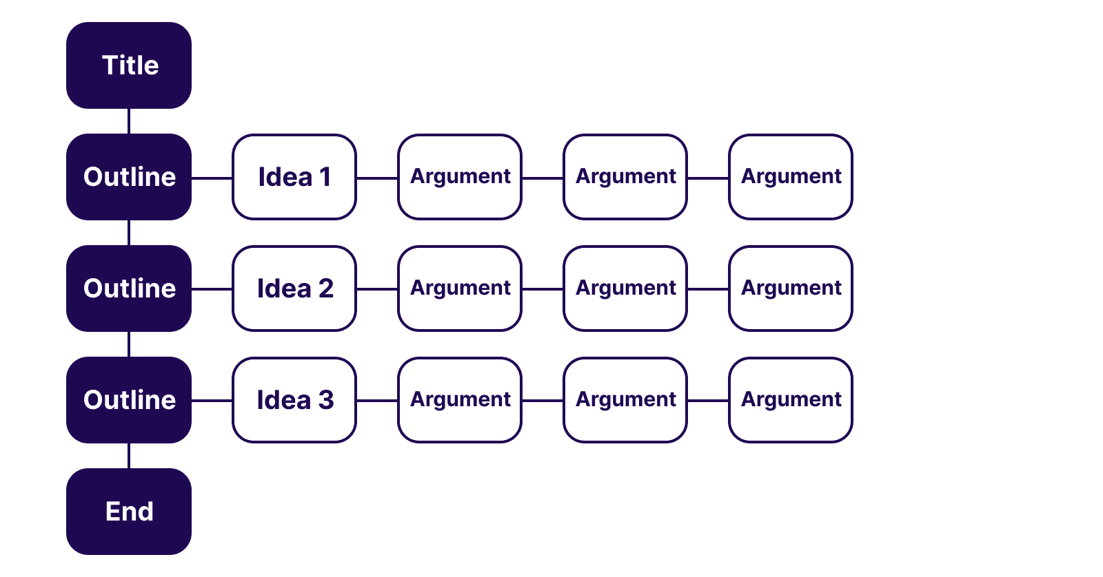
An indispensable aspect of your slide deck is that it needs to have a flow.
All successful presentations have a clear structure, so make sure to map it out before you start designing your pitch deck.
After you customize all your slides, make sure to walk once more through the presentation deck and reorder slides in case they don’t convey the message you were aiming for.
4. Show — don’t tell — with high-quality images
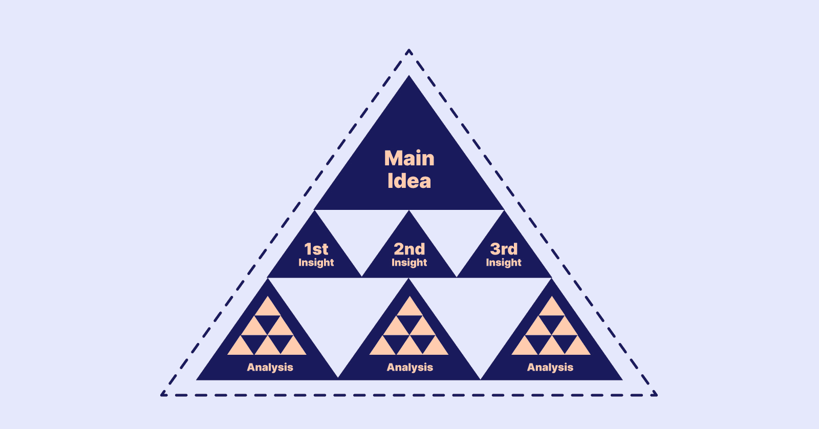
Show — don’t tell. This is the core principle of visual communication and the most important thing to remember when creating a slide deck presentation.
You have all the required information to make it easy for your audience to understand your point, so why not use it?
This means that whenever possible, add images instead of stock images or screenshots from other sources (or even your own).
Stock images from Unsplash or Google Photos are generic — if you want something specific (like a chart), find an image that has been created for that purpose. Screenshots can be useful for showing how something works in real life, but they often don’t communicate effectively because they are usually cluttered with text and other distractions.
The bottom line: show what you mean by using appropriate, high-quality images that illustrate what you're talking about clearly.
5. Have a consistent style throughout your presentation
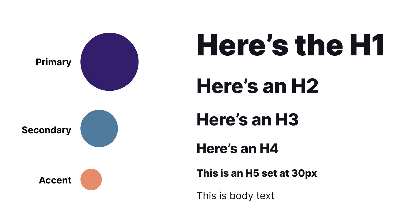
Having a consistent style throughout your slide deck helps to create a professional and cohesive look. It also helps to keep your audience focused on the message rather than focusing on you, which is especially important if you're presenting in person.
Consistency also makes it easier for you to get into a rhythm and helps the audience to stay engaged with what's happening on screen.
If you use different fonts throughout your slides or use different colors for headings and different colors for text (and vice versa), it could be confusing for your audience.
If they have trouble reading one thing because it's written in purple with an extremely small font and another thing because it's written in red but has bigger letters than usual, they might lose interest quickly—and that wouldn't make anyone happy!
Consistency is essential not only for creating an impactful presentation but also for keeping everyone focused on what really matters: delivering quality content that will leave an impression on your audience!
Best practices for using and choosing fonts:
Avoid font sizes smaller than 18pts.
Avoid using Comic Sans to maintain a level of professionalism.
6. Keep animations and transitions simple

You don't want your audience to be distracted by the visual presentation, so avoid animations that are too distracting—unless you're using them for a specific reason, of course.
This is why we recommend avoiding text animating on-screen at all costs (unless it's for humor or something else that doesn't distract). Instead, use animation to add to what you're saying—for example, when explaining how some aspect of your product works or how many things it can do. If done right, it'll add flair and interest while simultaneously reinforcing your message!
Transitions are also very important in a slide deck visual presentation, but should be used sparingly; they can quickly become overwhelming if not used properly!
7. Add a takeaway

The takeaway is the most important point. It should be a summary of the slideshow's key points. The takeaway should also contain a call to action, urging viewers to take some kind of action based on what they've learned.
Are you ready to create your own powerful slide deck?
We hope you’ve enjoyed this look at some of the best tips for presenting data visually. When it comes down to it, there are only a few key things that make a slide deck great: consistency, simplicity, and accessibility.
If you can keep these three elements in mind when designing or creating your presentation—whether in PowerPoint, Google Slides, Figma, or another program—we guarantee that your slides will be easier on the eyes than ever before!
If you're still not sure how to build an effective slide deck, I can help you build a Slide Deck with Style.
Join 3,800+ solopreneurs & professionals who are:
Building trust with personalized branding
Increasing sales with premium packaging
Creating clear offers that convert
Get dollar-driven design tips in your inbox 2-3x a week.
More Posts


