5 MIN READ
•
Writing
Stop saying "Learn More": How to create buttons that convert
Discover the power of Call-to-Value buttons and transform curious visitors into customers

It’s 6:26 am. It’s dark in the living room, which is technically a family room, as my three-year-old likes to tell me.
Maybe I call it that out of laziness.
I still call long-sleeved shirts spun with anything from wool to cotton “sweaters.”
But then there are the details that matter.
The sketchbook paper I use has a specific weight of 80 GSM.
The ink refills of my pens are 0.6mm Schmidt P8126.
And the buttons on my website will never say “Learn More.”
You can't sell, read, or buy something online without clicking a button.
Buttons are the gateway between talking about your product or service and delivering. A simple tweak in button copy can be the simple fix for increasing conversions 2-4x.
The problem is we love buttons, but we're lazy.
So we go and name them like:
"Subscribe now"
"Sign Up"
"Submit"
"Learn More"
None of these describe what is happening next, or the benefit to the visitor.
Imagine your button on a blank page.
Just because buttons are placed after a header and subhead doesn’t mean they’re noticed in that order.
Visual priority doesn’t work that way.
Buttons are often seen first.
They are contained in a high-contrast box, which draws your eye toward it sooner rather than later.
Imagine a visitor lands on your page, and before reading anything, they are told to “Learn More.”
Learn more of what? Now they have to go back and read to figure out exactly what you’re offering.
This effect of bouncing around a page is tiring and frustrating. By the time someone clicks, they could be gone.
Instead, lean into this simple hack and imagine what the button should say if there was nothing else on the page. This will help you label it correctly.
Call to Value (CTV) vs Call to Action (CTA)
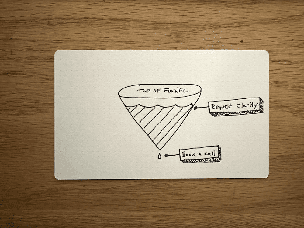
You might think all buttons are calls to action.
But not every button forces a visitor to take immediate action.
"Buy Now" is a very different intent than "View my Services."
Call-To-Action buttons are close to the sale.
These are easy to name because they're the last thing someone clicks before saying, "I'm in!":
They should feel safe, direct, and give the visitor confidence in what is happening next.
Call-To-Action Buttons look like this:
"Complete order"
"Book a call"
"Add to Cart"
“Buy Now”
They are immediate and simple. Close the deal with a Call-To-Action button.
But Call-To-Value buttons should drive curiosity and set up the call-to-action.
This is where most people miss out on serious button-clicking opportunities to state what is happening next.
If your "Book a Call" button still requires three more steps before actually booking the call, then it's misleading and confusing. Book a Call should be the last button, not the first.
You're closer to the top of the funnel and need to use curiosity and value to guide someone.
This is where call-to-value buttons shine.
Instead of Learn More, try...
Request a Breakthrough
Reduce your Anxiety
Ask yourself, "Is someone taking action right now?" If not, pull them in with curiosity.
Then, imagine your button on a page by itself and name it appropriately.
Now I have to find a sweater to put on.
Join 3,800+ solopreneurs & professionals who are:
Building trust with personalized branding
Increasing sales with premium packaging
Creating clear offers that convert
Get dollar-driven design tips in your inbox 2-3x a week.
More Posts


