6 MIN READ
•
Design
The four page personal website that will never get updated
Why you'll never stay motivated to update your website when you use these four generic pages

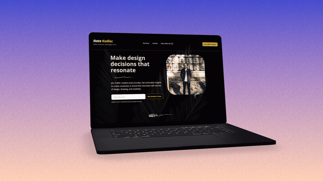
After four years, I've started to redesign my personal website.
I'm proud of my current one, but that was built while I was employed full-time and before I really started writing and building courses.
In a sea of popular dark mode and black and white templates, I'm defining the look and feel, and more importantly, how to organize and navigate my content.
Failing to structure your content and ideas intentionally is one of the sole reasons your website lacks focus, bounce rates are high, and visitors are not converting into subscribers or customers.

Retail stores like Ikea have nailed their content strategy. They pull you around various content—or rooms—by nudging you in subtle ways to ensure you never get lost. And you can't really leave the store without walking right through the checkout area, forcing you to sneak out if you walk through empty-handed.
So here's how to build a personal website like an Ikea store and make sure everyone sees your offer.
The four-page recipe to destroy your goals

The four pages will kill your motivation whenever you want to build your site:
Home, About, Blog, and Contact pages.
These pages are relics of the old internet: free of algorithms, social feeds, and dwindling attention spans.
Most templates include these pages, as if they're the standard for what a successful site should be.
But it's not even close.
A content-forward framework

Instead of thinking of your site in terms of pages, use this simple formula to create a site as effectively as possible.
Skill + Goal + Educate + Action
This formula works for most professions because its goal is to highlight your skill, define a goal, help people for free, and tell people what to do.
Skill: Define how you can help people
Goal: What problem do you want your site to solve?
Educate: Give something away for free
Action: Tell people what to do next
A site with many pages doesn't mean it's more effective.
Each page should be treated as a landing page for a clear idea.
(Tip: My Design Vault has over 35 great examples of personal websites, with over 120+ more highly designed inspirational sites. How's that for an action to take? 🙂 )
Aaron Francis' navigation has a unique structure. His particular skill is creating educational videos that developers love to watch. He leads with his content and then follows it up with a link for sponsorship opportunities.

One idea for Aaron would be to call out one clear action to take in the navigation and highlight it over everything else. Overall, his navigation feels intentional and specific to his goals of booking client work and sponsorship revenue.
What are your skills and goals?
Start with defining your skill, and highlight how you can help your audience.
While I'm a designer, teacher and blogger, none of that means anything to you!
So I don't start out by saying ”Hi, I'm Nate. A designer, instructor, and blogger.” Who cares!
Instead, I hope to drive curiosity around why design matters for first impressions and emphasize my goal of signing up for this newsletter. This nugget of an idea starts to relate to much of what I talk about, focused on how it can help you.
Eventually, I'll replace that action with more compelling content on why I think everyone should have a personal website.
I also plan only to include pages I have meaningful content for, all promoting my newsletter and products and services.
It's a simple formula, but you shouldn't spend time building a site without considering your goals.
Remember: Skill, Goal, Educate, and Action.
Join 3,800+ solopreneurs & professionals who are:
Building trust with personalized branding
Increasing sales with premium packaging
Creating clear offers that convert
Get dollar-driven design tips in your inbox 2-3x a week.
More Posts


