6 MIN READ
•
DESIGN
Define your visual style in five steps
How to set your visual foundation for timeless design decisions


Most days you’ll find me wearing a black V-neck and black pants. Not because I think it’s cool, but because it’s one part convenience and one part easy to match.
I wear black because I’m lazy.
And black just works. It’s highly unlikely you’re going to dress in all white, all purple, all green, or all yellow.
Although maybe I should be convinced otherwise?
Your visual style can be an anchor for your design decisions. It doesn’t always need to be expressed in every single medium. I dial down my visual style in the clothes I wear, but it doesn’t mean I don’t let them fly in many of the products I build.
In fact, I define my fashion choices by what I don’t like, versus what I do like. For example, I hate wearing anything heavily branded. I’d rather work out in a black cotton t-shirt than a Nike-branded moisture-wicking shirt.
I own very few printed tees because I’m lazy.
But launch a new website? This is where I think it’s important to lean into your visual style. You can’t greet every person who visits your website, so you’re trying to connect with people through words and visuals. Not easy to do!
Here’s a simple process I use to start the process of creating a visual style and say f*ck minimalism. Visual styles should be complemented with accessible practices like underlining link text to ensure clarity for all users.
For this piece, I’ll use a real example from our new game studio, Hey, Good Game.
Introduction: What is Visual Style?
Visual style is the unique fingerprint of a creator’s work, encompassing the visual elements and design styles that make up the overall aesthetic and feel of a brand, product, or artwork. It’s not just about the elements you see; it’s about the message they convey. Think of it as the visual cues that tell your story without words. Whether you’re a filmmaker, designer, or any creative, understanding and developing a distinct visual style is crucial. It helps to define and express an identity, making your work instantly recognizable and memorable.
1. Get personal: Connect to a favorite place or story with your personal style
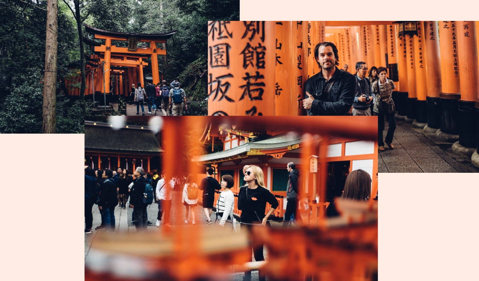
When I started to think about what kind of visual style I wanted to create for Hey, Good Game, I went to the stories and origins of some of my favorite puzzles. Sudoku and Hitori both have Japanese origins, and that small prompt took me back to a specific time I spent in Kyoto, near the Fushimi Inari Shrine.
Integrating personal style into your visual decisions can make your designs more authentic and unique.
Going through all my old pictures, I saw the color orange pop up over and over. The day was sunny, but the trail was crowded with cedar trees and bamboo. The Torri gates are all bright orange with dark markings in the names of the businesses and people who donated them.
Most people skip this step, and instead, go and mimic a website they like, or a color palette someone else created. But these decisions have already been made for someone else, and for a different reason.
The secret is to make design decisions that connect to your own life, then you won’t feel the need to update it six months later.
At this point, I quickly fell in love with this orange and black combination, although I want to be a bit careful with the easy overlap with Halloween.
2. Get curious: Create a visual research board with diverse visual elements
As of right now, I have two colors I know might work. While these choices will take me pretty far, I still need to find metaphors, objects, motifs, or other hooks that will connect me deeper to my decisions.
But I need to start doing some background research.
At this point, I want to start doing some research into the product itself. I want to find more connective pieces to pull this theme together.
I know we’re building and buying logic-based mobile and web games, and so many of these games use a grid structure. Sharp corners, 1:1 squares, high contrast tiles, and sometimes large letters for games like Wordle.
Incorporating pencil sketches into your visual research board can add a unique and personal touch to your design process.
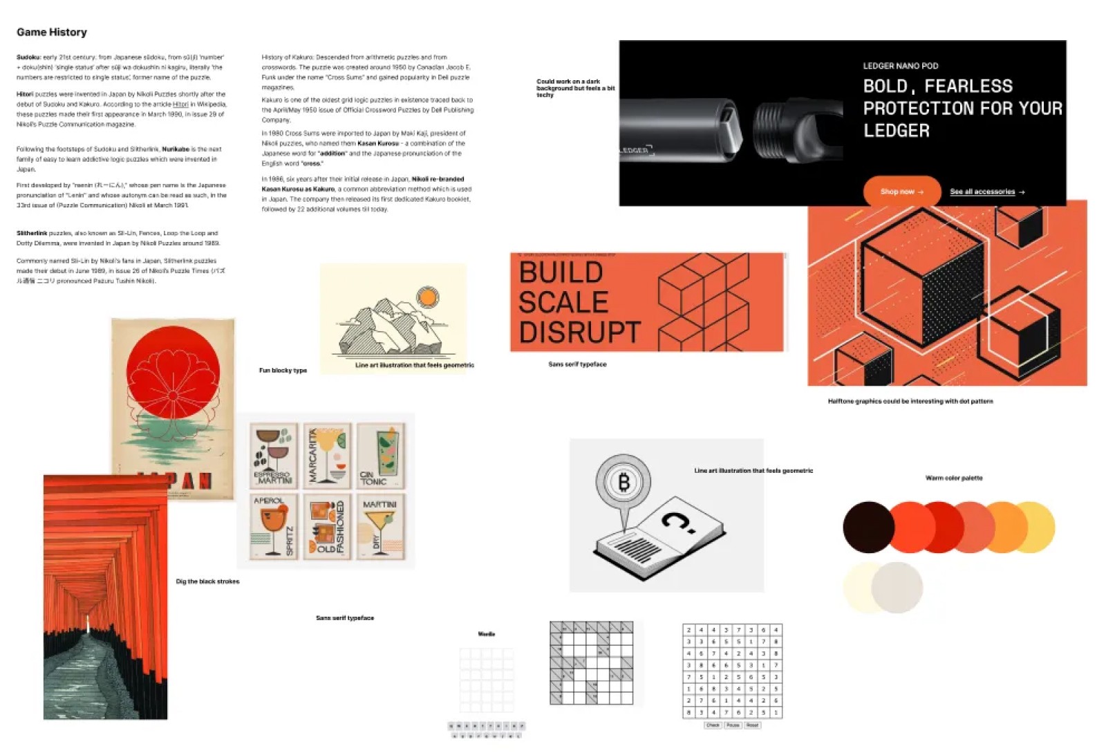
I’m really thinking about all of these pieces while collecting visuals, backstories, icons, and typography.
There might be intriguing ways to remix the interesting pieces and give them a new look that connects with the theme from step one.
Understanding Visual Elements
Visual elements are the building blocks of visual style, including shapes, lines, color palettes, typography, and negative space. Each element plays a significant role in conveying meaning and evoking emotions. For instance, shapes and lines can create a minimalist design or a flat design, giving a clean and modern look. Color palettes are powerful; they can set the mood and evoke specific emotions, like the classic red of Coca-Cola that screams energy and excitement. Typography, whether it’s thick-stroke fonts or the timeless New Roman, can speak volumes about your brand’s personality. And let’s not forget negative space—it’s not just about what you see but also what you don’t see, creating balance and focus in your design.
3. Embrace frequency bias: Look for patterns
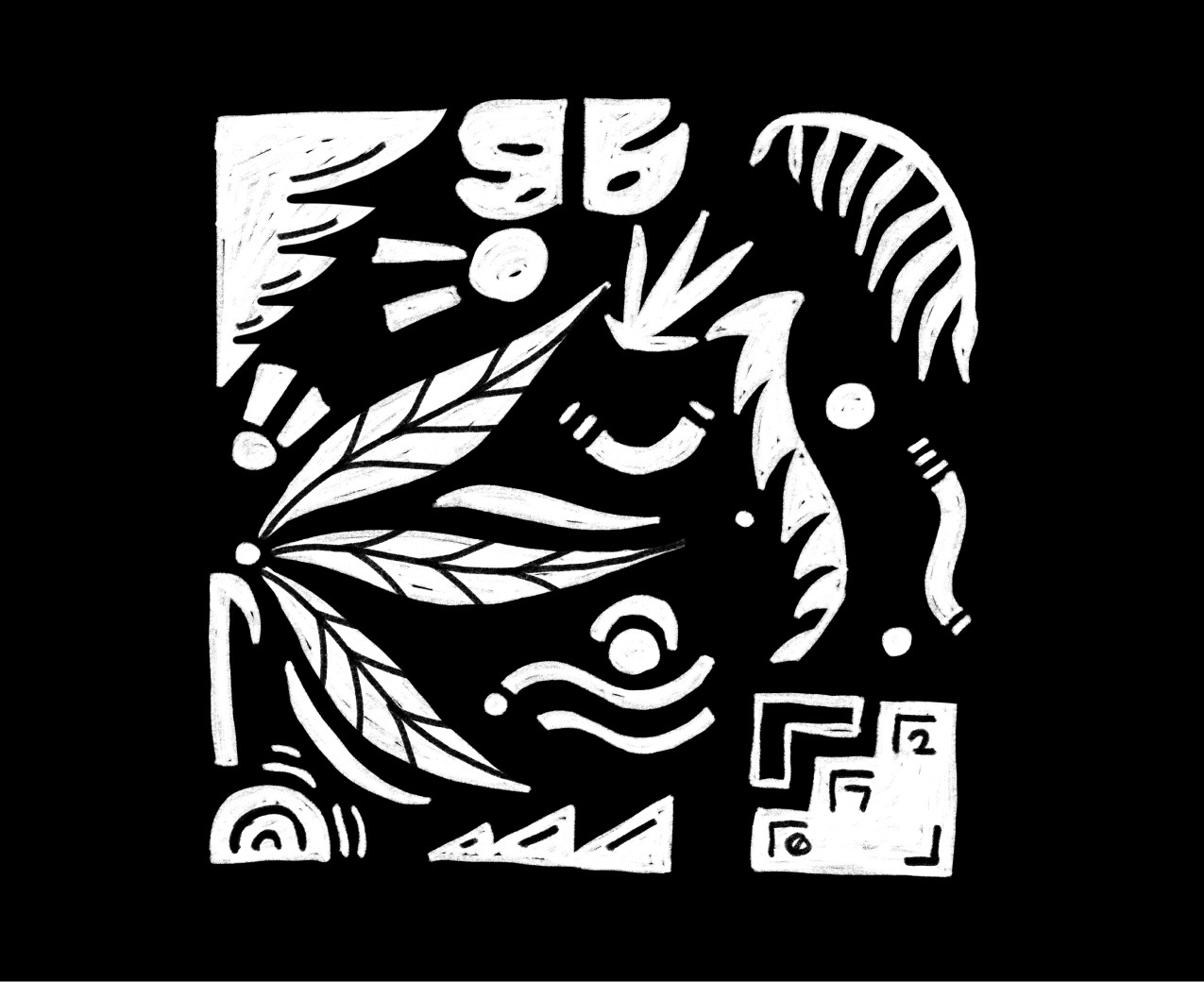
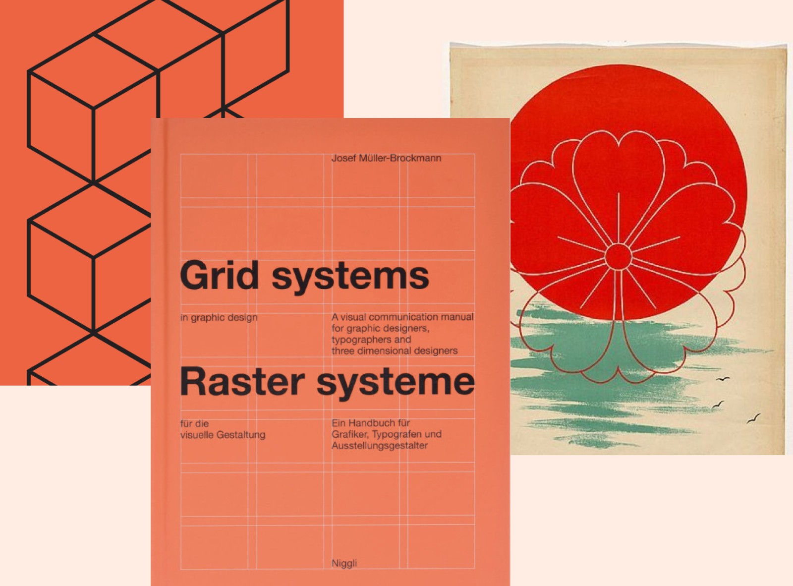
Throughout my research, I started seeing a number of grids pop up. Then I noticed the color orange in the objects around me. Shortly after, I noticed a design book near my desk called Grid Systems, which is set in a similar orange, using black type, and is a book on grids!
While it’s not uncommon for this to happen when you start chasing rabbit holes, you should embrace this cognitive bias. It’s an enjoyable experience in design, especially when you’re trying to define a visual style.
Alongside the black and orange pairing, and overall grid structures, I loved how circles kept popping up in various ways. Patterns like flowing lines and dynamic curves, characteristic of organic design, can emerge during the research process. It contrasts the other shapes easily, and so I want to keep this around for safekeeping. In the back of my head, I started thinking about using an exclamation point due to its universal symbolism for excitement, and the instant energy it brings.
So, lock into anything that pops up 3-4 times around you, and give it serious consideration. Seeing these patterns confirms the direction I am heading in, giving me the head nod to keep exploring.
Exploring Design Styles
Design styles are the various approaches to creating visual elements, including minimalist, vintage, organic, flat, and luxurious styles. Each style has its unique characteristics and can be combined to create unique and interesting designs. For example, a minimalist style focuses on simplicity and negative space, stripping down to the essentials for a clean look. On the other hand, a vintage style incorporates nostalgic elements, often reminiscent of a historical period like World War II, evoking a sense of nostalgia and timelessness. Understanding these design styles helps designers and creatives to define their visual style, making their work more discoverable and appealing to potential clients.
4. Check yourself: Are you straying too far?
This is just a simple checkpoint before starting to apply these initial decisions to a broader design project. Are you happy with the theme? Are these decisions personal and relevant to you?
Using straight lines can help maintain simplicity and clarity in your visual style, contributing to a clean and organized aesthetic.
Another trick I normally do is to sleep on it. If you wake up in the morning and still love the path you’re on, listen to your gut and don’t overthink it.
For many people, making design decisions takes far too long, because they continue to question themselves and whether or not it looks good.
Stick with your stories, connect visuals to them, and these initial themes will be the seeds for your products, websites, apparel, emails, apparel, and more.
Visual Styles and Brand Identity
Visual style is crucial in establishing a brand identity, encompassing the brand logos, image, and story. A well-defined visual style helps in communicating the brand personality and core values effectively. Think of it as the visual language of your brand. A comprehensive visual style guide is a crucial tool for ensuring brand consistency across all mediums. Logo guidelines, for instance, are essential for maintaining a consistent visual identity. Designers can use natural elements, play with white space, or incorporate real-life objects to make each piece unique yet aligned with the overall design. This consistency helps in building a strong, recognizable brand.
5. Create a definitive visual taste palette with various visual styles
The last step is to build out an edge-to-edge board filled with visuals, type, color, shapes, and everything in between. I call this a taste palette. Do not leave any available white space!
The goal is to express your unique taste in a distinctive visual style, all stemming from your personal story.
Incorporating other visual cues, such as patterns and labels, can enhance the accessibility and clarity of your visual taste palette.
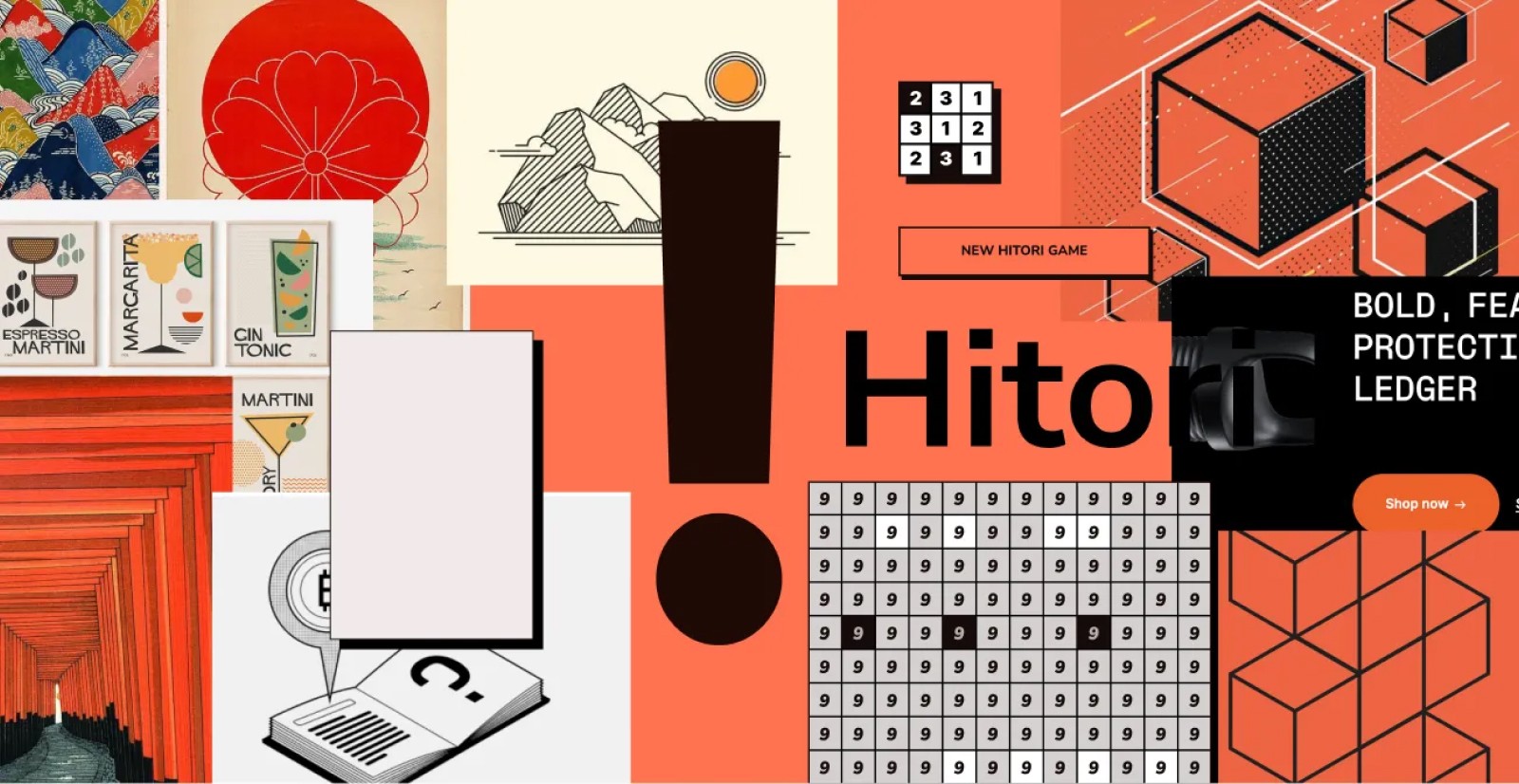
A simple technique is to set the background color in one of the colors you chose, then screengrab everything you found that’s related into one canvas.
Notice how we haven’t actually designed anything yet! We’re just being curious, experimenting, and seeing how far we can get without designing.
Once you have your taste palette, the next step is to design your site yourself or hire a designer to take this and run with it. Or, try this process using Midjourney to reverse engineer an image.
Most people skip this step and ask a designer to make these decisions, but having this ahead of time could save you thousands in revisions and redesigns later on.
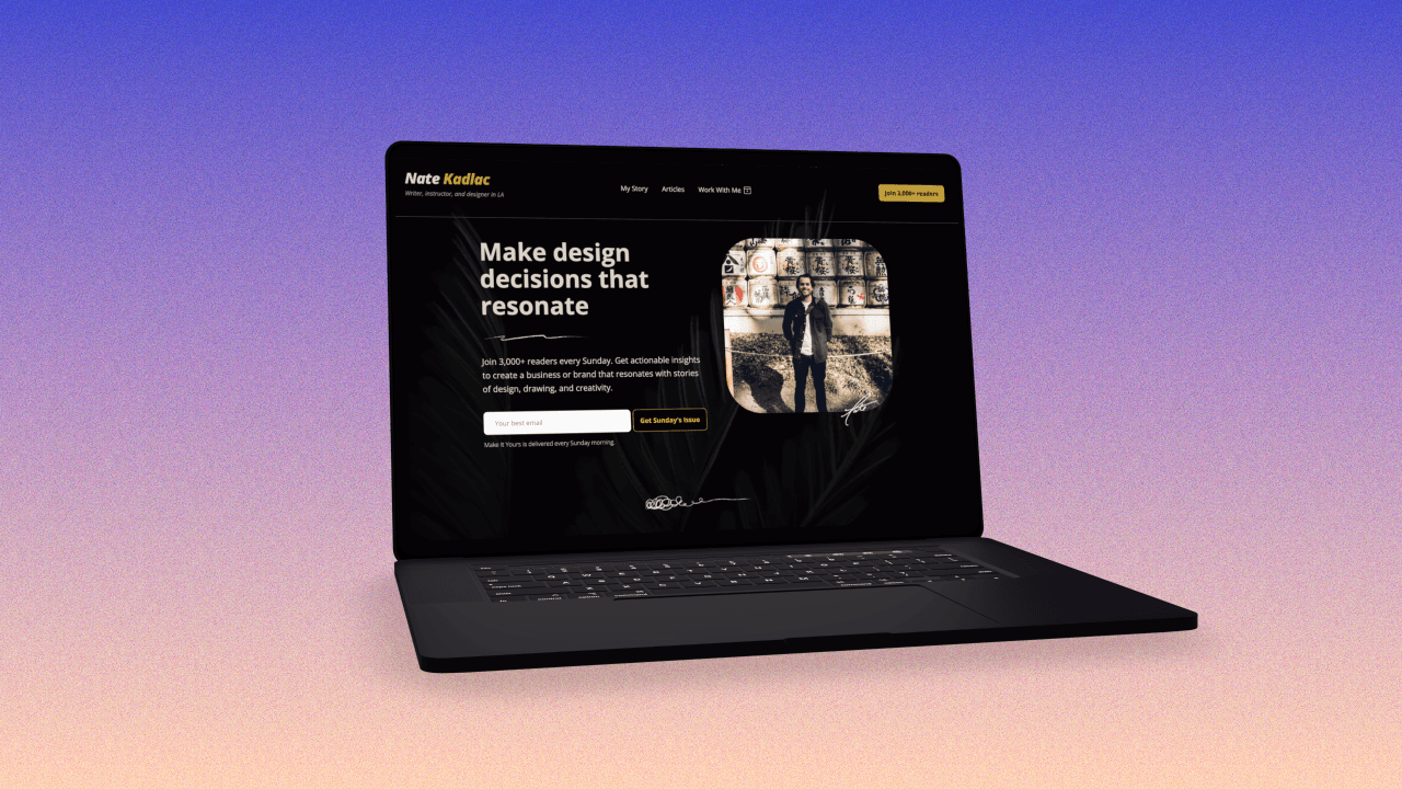
Feel free to view the final landing page here.

Join 3,800+ solopreneurs & professionals who are:
Building trust with personalized branding
Increasing sales with premium packaging
Creating clear offers that convert
Get dollar-driven design tips in your inbox 2-3x a week.
More Posts