12 MIN READ
•
Design
How to create a free or paid offering on your personal website
Build in an opportunity engine by creating this one page that's missing from your site

Every once in a while I'll stumble across a list of designer websites someone attempted to cobble together as a list of resources. In my experience, 90% of them end up as broken links, badly outdated portfolios, or “coming soon” pages.
I'm as guilty as the next person. For a long time, mine was always in a state of being redesigned.
These personal websites contain a portfolio project or two, an about page, and a goofy navigation system that looks like it was styled in the 1950s during the brutalist era.
For most designers who pride themselves on being empathetic, many of our websites are more user-friendly to a toddler who is attracted to pink blobs and words that don't mean anything.
But this is the problem with not just designer websites, but many of yours.
We generally view them as playpens for ourselves and not for our visitors.
This is wrong and there's one page that we can design to restore a sense of balance and offer something in return.
It's your offer page.
You could call it a Hire Me page, Work with Me, or even Consulting. But it's a page devoted to clearly explaining how you can help, your process, and at what price point.
And the interesting thing is, it could even be free.
Free or Paid? How to Choose the Right Offering for Your Goals and Audience
When I started writing a weekly newsletter, I was still working full-time as a creative director for a real estate startup company.
Because I was employed full-time and was only writing a newsletter, I had nothing to offer.
But, I felt stuck in my role, and I wasn't sure what was going to happen next. Did I want to continue this career path? Did I want to freelance? This writing thing seems interesting, but do I want to do this full-time?
There were so many questions I had zero answers for.
But I wanted to experiment and find another door that took me outside of my own network.
Your free offer
When you have nowhere to turn, this is the perfect moment for a free offer.
A free offer is suited for those who feel stuck, without an audience or a personal brand that exists outside of their identity as an employee.
This was me.
So I wanted to experiment: How do I meet and talk with more people outside of my network?
I was writing a weekly newsletter and had 56 subscribers. If you started a newsletter tomorrow and asked your friends and family to join, you would likely beat my subscriber count.
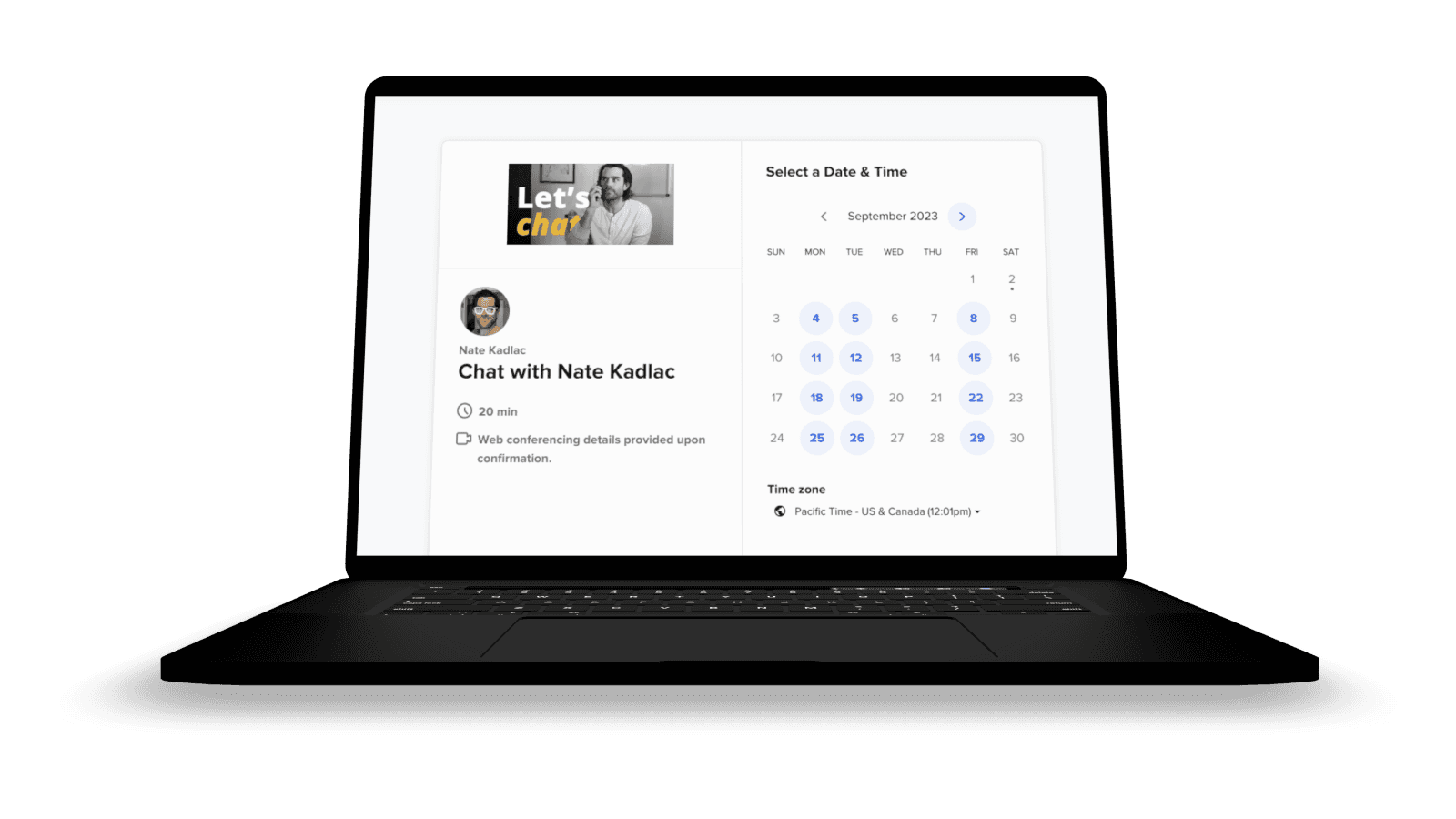
At the bottom of my emails, I created a Calendly link and started "Creative Calls" as a way for people who found my newsletter to book a 20-minute call for free.
My offer was simply called Creative Calls:

“Weird and crazy ideas are fragile. Sharing them with friends and family will leave you questioning those ideas. My offer is a free 20-minute call so you can share your idea with me and leave encouraged to pursue it."
I honestly didn't know what to expect or what to say. However I aligned my free offer with my interest in helping others pursue their ideas, hoping to give me confidence to pursue my own.
At first, many of them were with friends or acquaintances. Over time, I started to take calls from strangers all over the world, from Argentina to the streets of Tel Aviv.
Many of the calls helped shape what Approachable Design is today, but back then, it was just a simple free offer I pitched on my personal website and newsletter.
Your paid offer
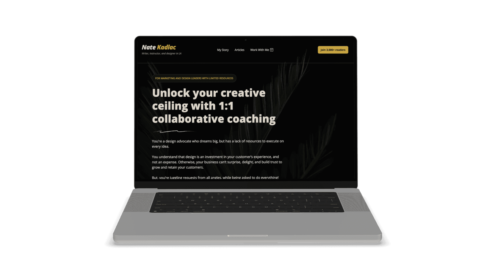
A paid offer works great if you're someone who has some established audience, or a product or service to sell. You might be a freelancer, coach, PM, or founder with some past trusted experience.
Even if you are these things, but aren't actively talking or publishing your ideas, I recommend defaulting to a free or affordable offer. The conversion rate is higher and will open you up to more conversations.
If you're looking to take another step forward, a paid offer might be the right path for you.
But, I'd only go this route if you have tested an offer with the right type of customer, and successfully booked a few free calls.
While offering a free Creative Call that has led me to talk with over 100 people, I created another free offer to chat for an hour with five people about their specific design obstacles. This gave me ideas, testimonials, and recordings about how to craft a paid offering.
Then the next five I charged $50. The five after that I charged $100. Then I launched my first cohort of Approachable Design of 10 spots at $250. From there my workshop turned into a scalable product that I've done seven iterations of.
I now have other offers for specific services, but only after I have tested them with real people, to ensure demand and feedback which I can use in my marketing copy.
Crafting a compelling value proposition: Why your visitors should care
There are a lot of resources for creating compelling offers. I'd recommend checking out Alex Hormozi's $100m Offers. Simply, creating an offer is not about you, but how you can help the customer save time, effort, or money.
You must think about the outcome someone can achieve after signing up for your offer.
In my free creative calls, I was helping them save effort by being a sounding board for their wild ideas. They were able to explore and be challenged about their ideas in a way that was supportive but tried to figure out if this was a waste of time or not.
Even if someone signs up for a free call, they still don't want to waste their time. Consider this when crafting your page.
How to create a simple free or paid offer page:
Who do you want to help?
What problem are you solving?
How will your solution change their situation?
How will you do it?
Who have you helped in the past?
Why are you capable of helping solve this?
What does it cost?
Who do you want to help?
The first thing to do is to determine who your offer will help. It's helpful to be specific, but if it's your first free offer, you can leave this more open-ended.
If you're a fitness coach, you might say, “Do you work remotely and struggle with lower back pain?" While it sounds corny, you're attempting to dial into a specific audience.
If it's a paid offering like my design coaching, I'm being very clear that it's targeting design leaders who have limited resources to support their in-house designers.
When possible, get specific and clear about who you want to help.
What problem are you solving?
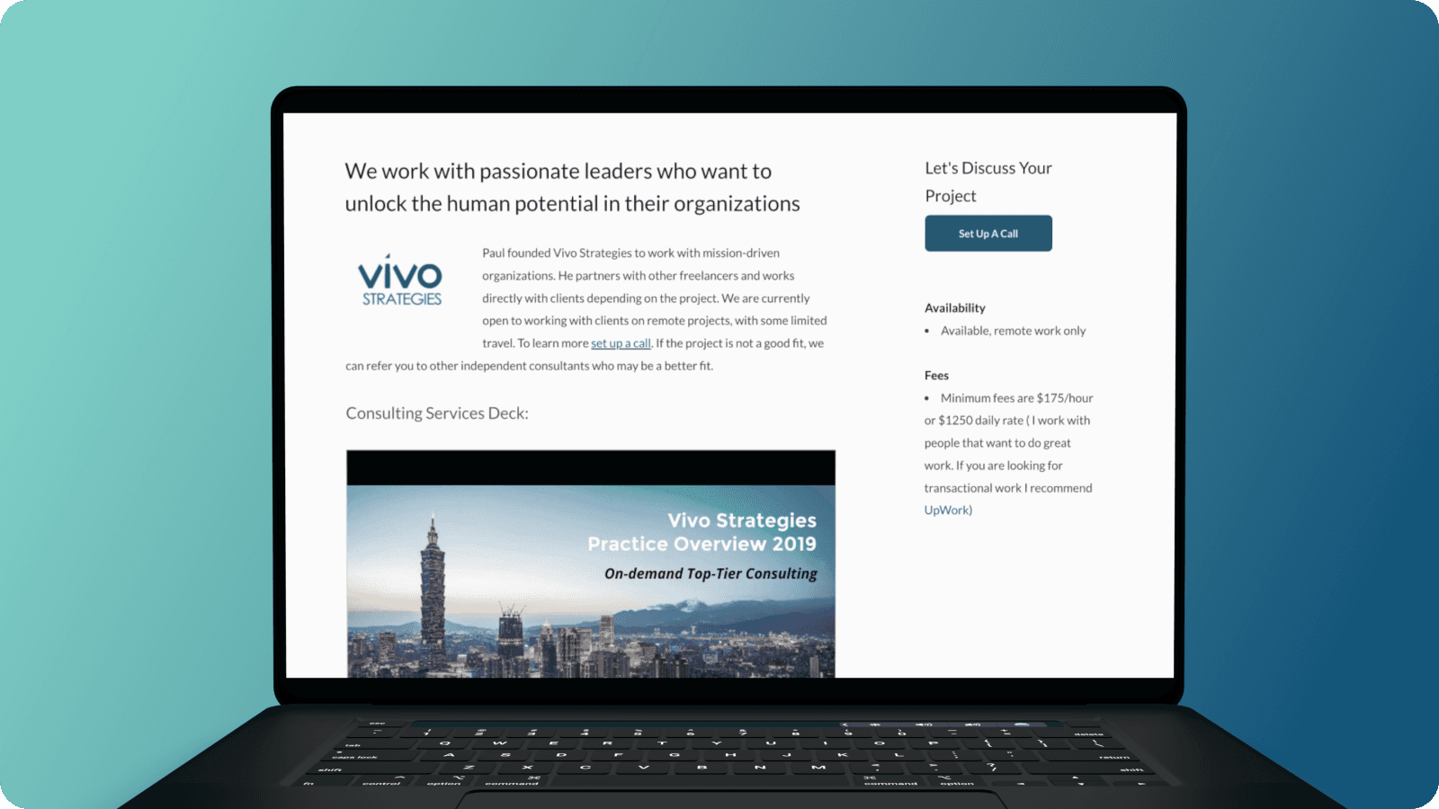
Next, you want to be clear about the problem you can help with. Again, it's good to be specific about the struggle or the source of the pain point here.
Alex Hormozi talks about describing every single step they might struggle with.
If you're helping creative agency owners grow their businesses, you could come up with a list of 20 bullet points (both real or perceived) that detail what they need to overcome.
Things like finding new agency leads, writing blog posts for SEO, onboarding automation of new clients, website redesign, crafting compelling offerings (hello!), and many more.
Think about every single point of frustration and pick a few to address in your offer. You don't need to be everything to everyone, but pick ones that are interesting to you and what might intersect with your background.
How will your solution change their situation?
We all want to escape our own frustrations and make life easier, happier, and have more free time. For some of my clients, that means hiring me to design a website that will attract customers, done right the first time, without stressing about it.
The website usually isn't really what they need. It's a tool to help them grow the business with more qualified leads, saving time by spending fewer minutes on the phone, or freeing up their day by creating marketing flywheels that automate a lot of the hand-holding.
Don't focus on the how just yet. Focus on the end result they get because of the how.
How will you do it?
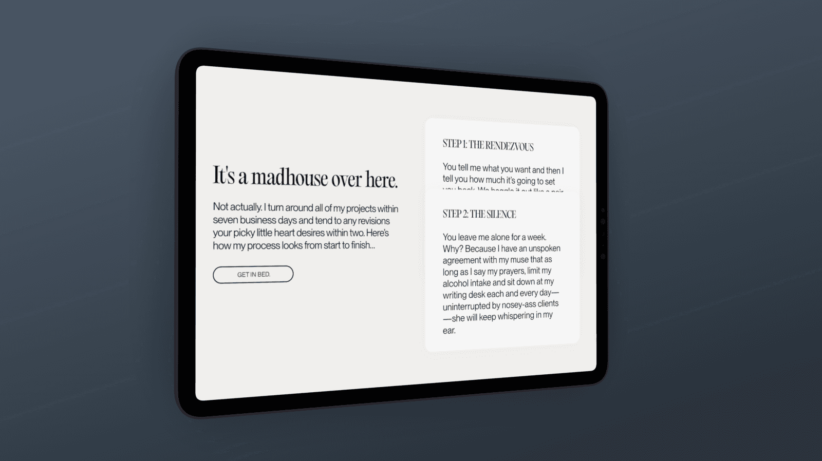
This section lends itself to how you will use your process to guide them to a solution. For my own workshop, I approach design in a very specific way called Inside Out Design.
I help creators make better design choices by connecting the decisions to fonts, colors, and brand decisions using their stories and experiences. In the end, I'll help you create a personalized design kit just by asking you a series of questions and teaching you to implement them yourself using Figma along the way.
It's not for everyone, but it's my own process.
Think about how you might walk someone through your process. Even if it's not fully formed, just list out a few bullet points to help someone visualize what the process is.
Who have you helped in the past?
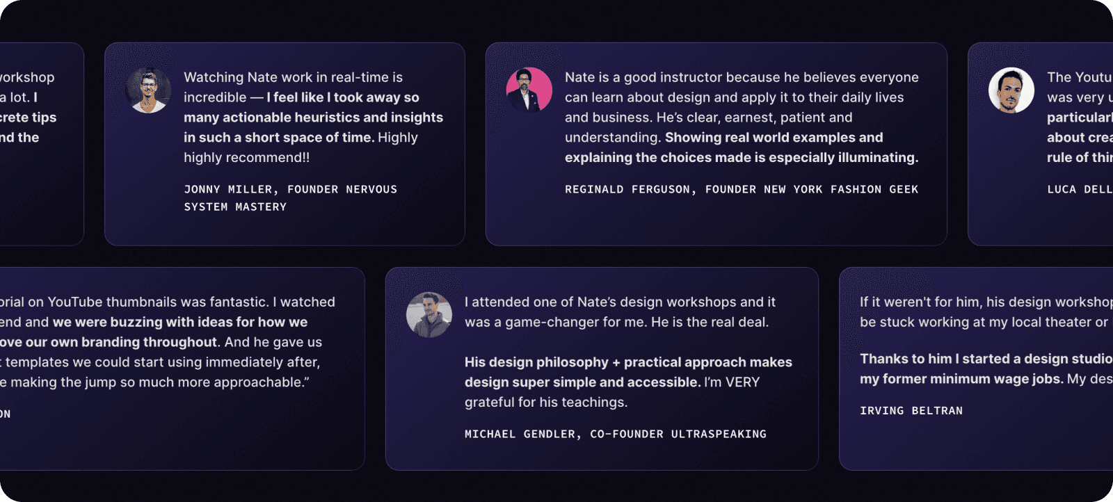
I used to scoff at LinkedIn's testimonials section. But it's actually quite brilliant to encourage employees to seek out reviews of their work.
This is what we want to include for our individual offers, on our own websites.
A free offer removes the financial risk someone takes on. But the more expensive your solution is guaranteeing, the risk becomes more terrifying. I talk about this in my landing page series. The more expensive the landing page, the longer it needs to be to carefully nurture the skepticism.
To overcome their inevitable skepticism, you need to include social proof that your process will lead to the outcome you're promising. This is why it's helpful to do this for free in the beginning, so you can build the social proof more easily.
For every client you help, start to think about asking for a testimonial. Treasure these as if you're mining for gold, because they truly help prove that you're worth spending time or money on.
As you dig up this gold, you can use these across your personal website in different areas, but especially on your offer page.
Why are you capable of helping solve this?
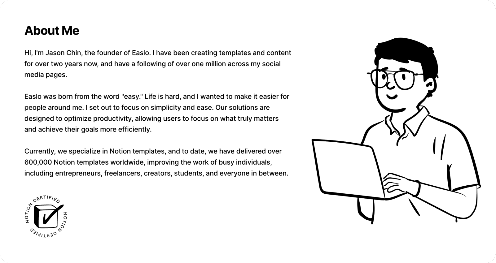
This section doesn't need to be extensive, but giving a few sentences on your background and why you're capable of their investment of time or money should stand out.
Here are a few ways to think about this:
How many years of experience do you have?
Who have you helped before?
What outcomes have you helped with?
What evidence do you have to support your claims?
Can you show visuals or screenshots?
Your CTA and what it costs
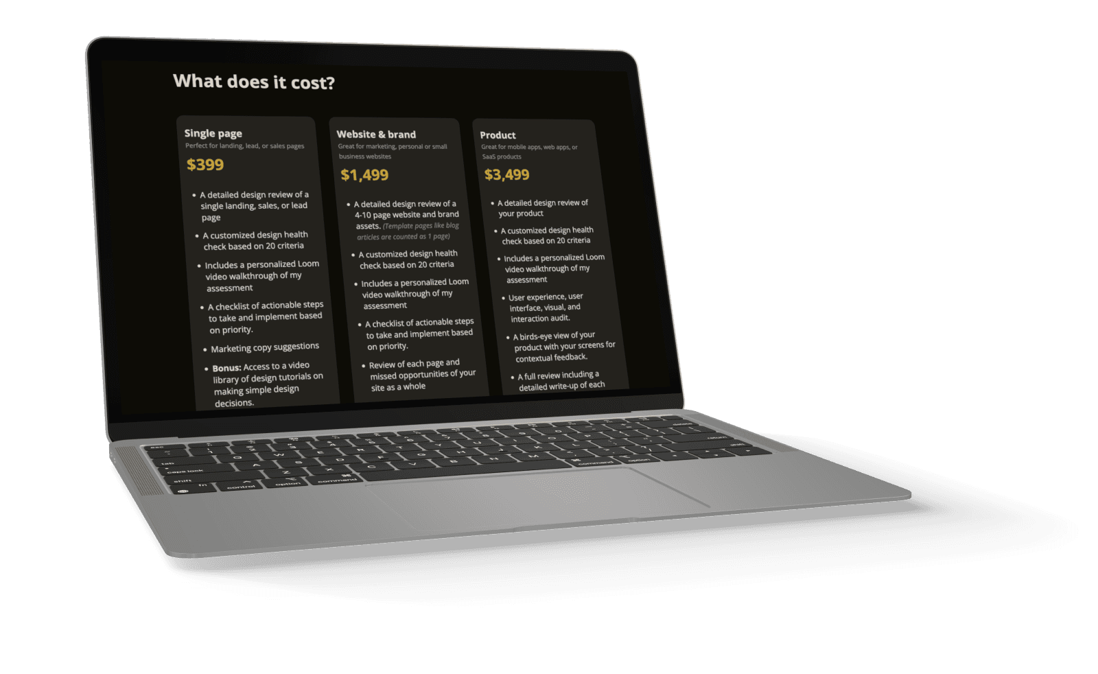
Lastly, think about a clear call-to-action for your page.
It should be direct and to the point. Use specific action-oriented verbs, and not generic buttons like "Learn More."
I'd also make it visually clear as a button and not just a text link. Make it stand out, with high contrast.
If it's free, highlight that it's FREE. If it costs something, make sure you're clear on this page what the total is, and not just skirt around the issue.
Optional: Adding creative bonuses or rewards for paid offers
This is reserved for adding an additional cherry on top. If you're asking for money, you can drive up the perceived value of a paid offering by getting creative with your time.
For example, I have a number of digital products that I can include by bundling them into any new offer I create.
I could also package my time, by saying I will offer an additional 1:1 follow-up call in 3 weeks' time.
It really doesn't matter, but anything helps increase the value as long as it aligns with your offer.
Your offer should 3-4x the time or money they spend on you
Your offer page doesn't require any fluff. It just needs to appeal to your ideal customer in a way that brings more value than either their time or the cash they're spending on you.
A simple rule I always follow: If you're creating a free offer, create $500 in value for them.
If you're charging $500 for an offer, make it worth $1,500-$2,000 in value. You'll get your testimonial and create raving fans.
Join 3,800+ solopreneurs & professionals who are:
Building trust with personalized branding
Increasing sales with premium packaging
Creating clear offers that convert
Get dollar-driven design tips in your inbox 2-3x a week.
More Posts


