How to choose colors with confidence
Issue
013

Give me three minutes to show you:
🎨 How to choose colors with confidence
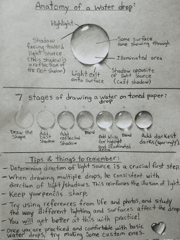
📣 Why Apple used water drops to design an interface
💻 Mind-blowing design tips for non-designers

“Does this color look good?”
This is the most common design question I get from creators.
When you make decisions about color, you’re also making decisions about your identity, and how the world perceives you.
It's like revealing a dark secret. It forces you to publicly announce that you secretly love the color brown and now the world knows you love it when a UPS truck drives by and what if they hate it?
And this week I chatted with Josh Spector about how to simply choose brand colors using my Inside Out Design process.
🎨 Better Design Decisions
Illustration animation is about to become much more approachable with the announcement of this new software. (And my favorite drawing app to date)
What's your favorite National Park color palette? (via Terri Lonier)
Design tips for non-designers.
📸 Make It Yours Moment
Apple designers studied this resource of the water drop when designing the first aqua interface for Mac OSX. When using drop shadows or gradients, study how they interact with the real world first. (Day 5 in the 80/20 Design challenge)
If you're one of the 100+ new readers who joined this week, welcome!
See you next Sunday!

Make It Yours Newsletter
Join 3,800+ solopreneurs & professionals who are:
Building trust with personalized branding
Increasing sales with premium packaging
Creating clear offers that convert
Get dollar-driven design tips in your inbox 2-3x a week.