How to design impactful (and beautiful) YouTube thumbnails
Issue
016

Give me four minutes to show you:
🎨 Design better YouTube thumbnails with 8 questions
📣 How to find business ideas people are already looking for
💻 How to design your visual style

We're about four weeks away from our second daughter dropping, and maybe not surprisingly, I'm feeling much more calm this time around.
While that's just around the corner, it feels like my business is picking up steam. I've been benefitting from my focus on Approachable Design, with several opportunities coming my way in the past month.
One thing that's as clear as the Los Angeles sky during a lockdown: I love working with creators and solopreneurs.
I’ve been fortunate to help advise and design YouTube thumbnails for several creators—people I admire like Lenny Rachitsky, Paul Millerd, Khe Hy, Nat Eliason, and Josh Spector.
A common theme I’ve found is that if you don’t have high-quality assets to work with, or that you’re trying to include too many elements into a small space, your YouTube thumbnails will suffer.
The importance of YouTube thumbnails
A thumbnail’s job is the same as a great subject line, hook, or Facebook ad:
To drive curiosity and get someone to click in a way that builds trust.
Trust that they won’t be misled into clicking something they will regret.
Trust that you deliver on the promise of your YouTube thumbnail.
And trust that you don’t waste their time with clickbait.
And so there’s the dilemma. How do you show up on brand, drive curiosity, and still optimize for video thumbnail click-through rates? (While still making your thumbnails look great?)
The secret is to focus on four main areas.
The secret is to focus on four main areas: spacing, imagery, contrast, and text.
That’s all you need.
If you try to say or show too much, you’ll end up confusing the message and focal point. And with the limited space you have, your design will suffer in quality, because it will lack visual hierarchy and clarity.
Check out my article this week breaking down each of these, and the eight questions I ask when designing thumbnails.
🎨 Better Design Decisions
How to find ideas that people are looking for via Steph Smith
How to design your visual style in 5 steps
Why Stripe's CEO says quality and design matters
📸 Make It Yours Moment
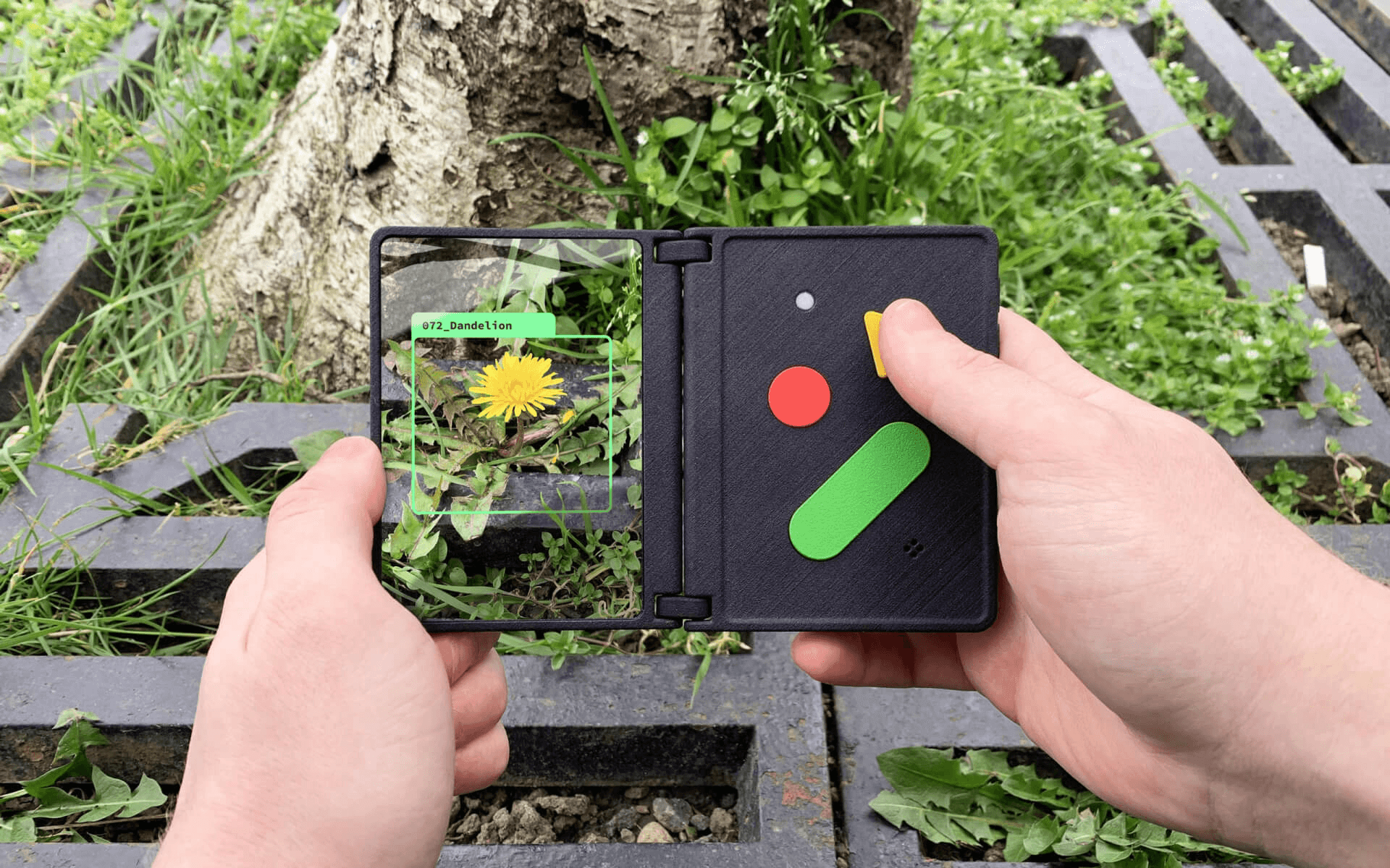
A clever and fun AI pocket field guide. These are the personality-driven products that get me excited about technology.
Later this week, I'm attending a Mastermind hosted by ConvertKit's founder, Nathan Barry. I'm excited to share what I learn and to find new ways to continue driving more impact to you with Approachable Design.
Thanks for being here, and I'll see you next Sunday!

Make It Yours Newsletter
Join 3,800+ solopreneurs & professionals who are:
Building trust with personalized branding
Increasing sales with premium packaging
Creating clear offers that convert
Get dollar-driven design tips in your inbox 2-3x a week.